 kojika17
CSSで2カラムを作ってみる
CSSで2カラムといっても、その作成方法は様々です。
多くのパターンを理解することは、CSSに柔軟性を持たせることに、つながります。
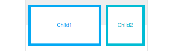
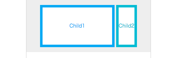
1. floatを利用する
基本的な方法です。
子にfloatを利用すると、灰色の背景を敷いている親の高さが算出できなくなるため、背景色が出なくなったり、レイアウトが崩れたりします。
これらの問題を解決するには、clearfix か overflowを利用する必要があります。
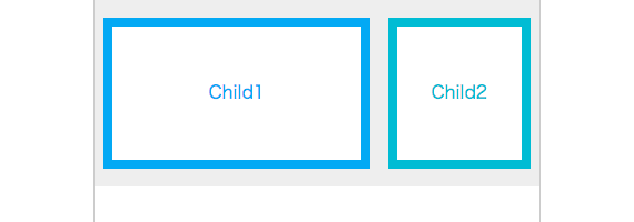
.parent {
  overflow: hidden;
}
.child1 {
  float: left;
  width: 240px;
}
.child2 {
  float: right;
  width: 128px;
}
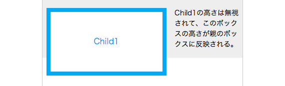
2. floatとmarginを一定方向にかける
片方にfloat、片方はfloatをかけた方向に隣の要素の横幅以上のmarginをとる方法です。
floatのかかっている数値は固定して、文字の部分を伸縮させる時などに非常に効果的です。
この方法を利用すると、floatのかかっていないボックスの高さに依存して、親の高さがとれます。
そのため場合によっては、floatを解除しなくても、レイアウトを崩さずにコーディングすることも可能です。
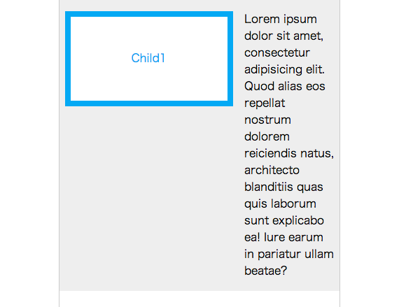
.child1 {
  float: left;
  width: 240px;
}
.p-child2 {
  margin-left: 256px;
}
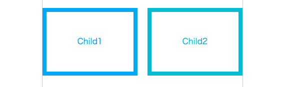
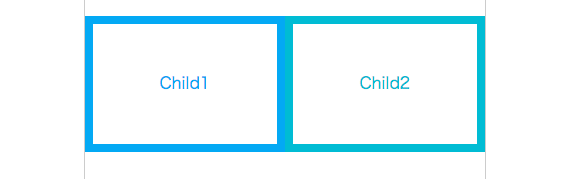
3. floatと隣接のボックスにoverflow: hidden;をかける
上記の方法だとmarginに数値を設定する必要があるため、より柔軟にするためにoverflowを利用します。
overflowを利用すると、書式コンテキストが確立するため、回り込みが起こらずに2カラムを実現することができます。
レイアウトに、より柔軟性を持たせたい時に有効な手法です。

.child1 {
  float: left;
  width: 240px;
  margin-right: 16px;
}
.p-child2 {
  overflow: hidden;
}
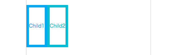
4. floatとマイナスマージン
親のボックスが400pxで、子のボックスに幅190pxとmargin 20pxが指定されている場合。
(190+20)*2 = 420
全体幅が420pxとなり、400pxの親のボックスよりも大きくなるため、通常ならカラム落ちが発生します。
しかしマイナスマージンを加えることで、IE8以上であればカラム落ちを防げます。
.parent {
  overflow: hidden;
  margin-right: -20px;
}
.child1,
.child2 {
  float: left;
  width: 190px;
  margin-right: 20px;
}
この方法は2カラムだけに限定するよりも、数カラムになっているリストなどにも役立つ方法です。
このパターンは、よく使えるわりに計算が面倒くさいので、Preprocessorのmixinなどを利用すると計算が必要なくなります。
SCSS, Sass, Less, Stylus の例
SCSS
@mixin layout-pattern($areaWidth, $colNum, $colGap, $childEl: li, $legacy: false) {
// layout-pattern(親の横幅, カラム数, カラムの間隔, 子のセレクタ, IE7以下に対応する?(デフォルトは、対応しない))

  $colAreaWidth: $areaWidth + $colGap;
  overflow: hidden;
  margin-right: -#{$colGap};
  @if $legacy {
    width: $colAreaWidth;
    zoom: 1;
  }
  #{$childEl} {
    float: left;
    $colWidth: $colAreaWidth / $colNum - $colGap;
    width: floor($colWidth);
    margin-right: $colGap;
    @content;
  }
}

ul {
  @include layout-pattern(400px, 5, 8px)
}
.test {
  @include layout-pattern(400px, 4, 16px, ".col") {
    border: 1px solid #000;
    margin-bottom: 20px;
    box-sizing: border-box;
  }
}
Sass
=layout-pattern($areaWidth, $colNum, $colGap, $childEl: li, $legacy: false)
  // layout-pattern(親の横幅, カラム数, カラムの間隔, 子のセレクタ, IE7以下に対応する?(デフォルトは、対応しない))
  $colAreaWidth: $areaWidth + $colGap
  margin-right: -#{$colGap}
  overflow: hidden
  @if $legacy
    width: $colAreaWidth
    zoom: 1
  #{$childEl}
    $colWidth: $colAreaWidth / $colNum - $colGap
    float: left
    width: floor($colWidth)
    margin-right: $colGap
    @content

ul
  @include layout-pattern(400px, 5, 8px)

.test
  @include layout-pattern(400px, 4, 16px, ".col")
    border: 1px solid #000
    margin-bottom: 20px
    box-sizing: border-box
Less
// もう少しブラッシュアップしたい
.layout-legacy(@legacy-width) when (@legacy) {
  width: @legacy-width;
  zoom: 1;
}
.layout-pattern(@areaWidth, @colNum, @colGap, @childEl: li, @legacy: false) {
  // layout-pattern(親の横幅, カラム数, カラムの間隔, 子のセレクタ, IE7以下に対応する?(デフォルトは、対応しない))
  @colAreaWidth: @areaWidth + @colGap;
  overflow: hidden;
  margin-right: -@colGap;
  .layout-legacy(@colAreaWidth);
  @{childEl} {
    float: left;
    @colWidth: @colAreaWidth / @colNum - @colGap;
    width: floor(@colWidth);
    margin-right: @colGap;
    .child-content();
  }
}

ul {
  .child-content() {}
  .layout-pattern(400px, 5, 8px);
}
.test {
  @childEl: .col;
  .child-content() {
    border: 1px solid #000;
    margin-bottom: 20px;
    box-sizing: border-box;
  };
  .layout-pattern(400px, 4, 16px, @childEl);
}
stylus
browserLegacy = false; // IE6, 7に対応するか

layout-pattern(var)
  colAreaWidth = var[0] + var[2]
  overflow hidden
  margin-right -1 * var[2]
  if browserLegacy
    width colAreaWidth
    zoom 1

layout-pattern-child(var)
  colWidth = (((var[0] + var[2]) / var[1]) - var[2])
  float left
  width floor(colWidth)
  margin-right var[2]


ul
  layout = 400px 5 8px
  // 変数をスペース区切りで設定
  // foo = 親の横幅 カラム数 カラムの間隔
  layout-pattern(layout)
  li
    layout-pattern-child(layout)

.test
  layout = 400px 4 16px
  layout-pattern(layout)
  .col
    layout-pattern-child(layout)
    border 1px solid #000
    margin-bottom 20px
    box-sizing border-box
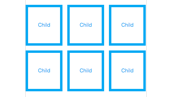
もしCSSフレームワークを利用していないのであれば、これらのmixinは有効に働きます。
レイアウトのmixinを用意しておくと、全体の幅、カラム数、間隔を指定するだけで、下記のようなレイアウトが簡単に作成できます。
5. positionを利用する
floatは、clearfixなどのテクニックによって、親の高さを出す方法がありますが、positionは親の高さが自動算出する方法がありません。
親の要素に高さを指定しておく必要があります。
.parent {
  position: relative;

  /*高さがでないことを示すため、あえてボックスよりも短くしている*/
  height: 50px;
}
.child1 {
  position: absolute;
  top: 16px;
  left: 8px;
  width: 240px;
}
.child2 {
  position: absolute;
  top: 16px;
  right: 8px;
  width: 128px;
}
6. positionとmargin
この方法の理屈は、floatとmarginの一定方向を指定する方法と原理は一緒です。
positionがかかっていないボックスの高さが、親の高さとして算出されます。
あまり利用する場面は少ないですが、見出しで飛び出したアイコンを表現する時などに、利用できるかもしれません。
.parent {
  position: relative;
}
.child1 {
  position: absolute;
  top: 16px;
  left: 8px;
  width: 240px;
}
.p-child2 {
  margin-left: 264px;
  font-size: 14px;
}
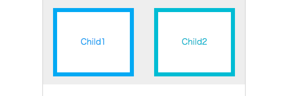
7. display: tableを使った例
display: table; はその名の通り、テーブル要素のように振る舞うことができます。
.parent {
  display: table;
  width: 100%;
}
.child1,
.child2 {
  display: table-cell;
  width: 50%;
}
table-cellだけでも、2カラムにすることが可能です。
ただし横幅100%にする場合は、親の要素にdisplay: table; が必要となります。
table-cellだけの例
.child1,
.child2 {
  display: table-cell;
  width: 50%;
}
8. display: inline-block;を使った例
2カラムというのは、強引かもしれませんが、widthなども利用でき、親の要素にtext-alignを指定すれば、中央寄せなども可能になります。
.parent {
  text-align: center;
}
.child1 {
  display: inline-block;
  width: 240px;
}
.child2 {
  display: inline-block;
}
9. CSS3のcolumnプロパティ
今までは、2つのボックスを並べていましたが、このCSS3プロパティは、1つのボックスの中で、複数のカラムを生成することができます。
仕様は勧告候補まで上がっていますが、なかなかベンダープリフィックスが取れず、使いどころの難しいプロパティです。
.parent {
  -webkit-column-count: 2;
  -moz-column-count: 2;
  column-count: 2;
}
10. CSS3のdisplay: flex;
この値は過去に、display: box;, display: flexbox;, display: flex; と名前を変えてきたCSSです。
利用できるブラウザが限定されますが、非常に柔軟なレイアウトが可能になります。
最新のInternet Explorer, Firefox, Google Chromeであれば、ベンダープリフィックスなしのdisplay: flex; が利用可能です。
ただし、Safariやスマートフォンのブラウザのことを考えるのであれば、autoprefixerを利用した方がいいでしょう。
.parent {
  display: flex;
  justify-content: space-around;
}
.child1,
.child2 {
  width: 160px;
}
むすび
これ以外にも、CSS Grid Layout Moduleなどありますが、ブラウザの実装状況が微妙な方法は省きました。
今回10パターンを紹介しましたが、floatに関する部分をマスターすれば、ある程度のレイアウトは組み立てることができます。
複雑そうなレイアウトに見えても、結局は紹介したパターンの繰り返しや、応用がほとんどです。
floatとマイナスマージンで紹介したように、同じことをしつつも面倒な計算が必要となる場合は、Preprocessorなどに任せるのも、ひとつの手です。